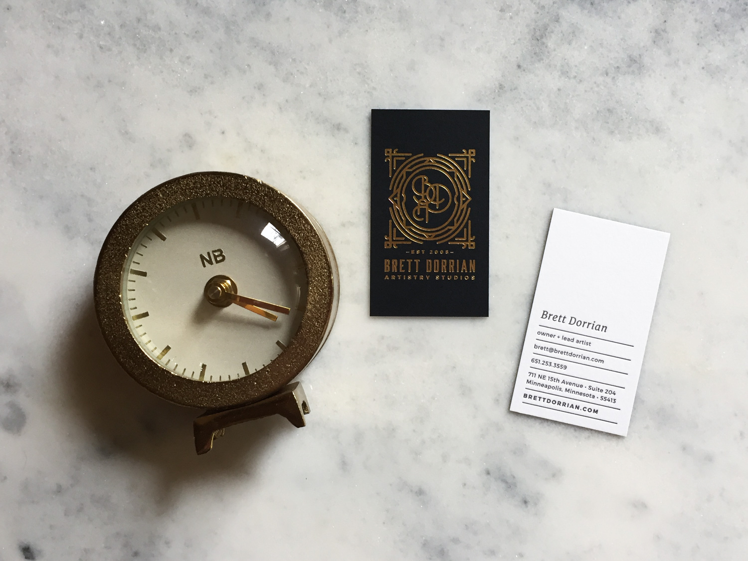
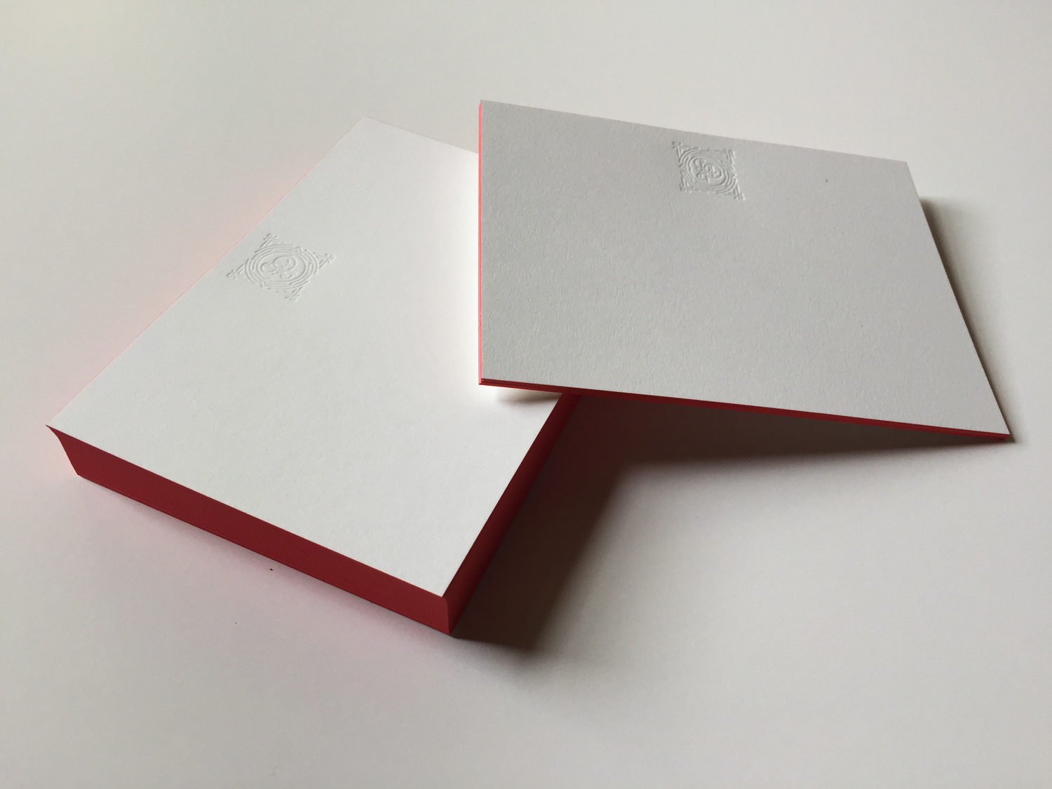
After our new letterpress stationery came in, I had to bring a notecard and envelope to our Senior Studio Coordinator, Mallory, so she could experience it.
The experience of the things that have your logo on them are just as important as the logo itself.
Everything in your marketing suite, whether printed or digital, says something about you and about your brand. Even the outfit you wear and the music playing in the background – it’s all part of how you are presenting who you are. And if you are doing a good job, what you hope to be communicating to clients is actually what they are getting from their experience with you.
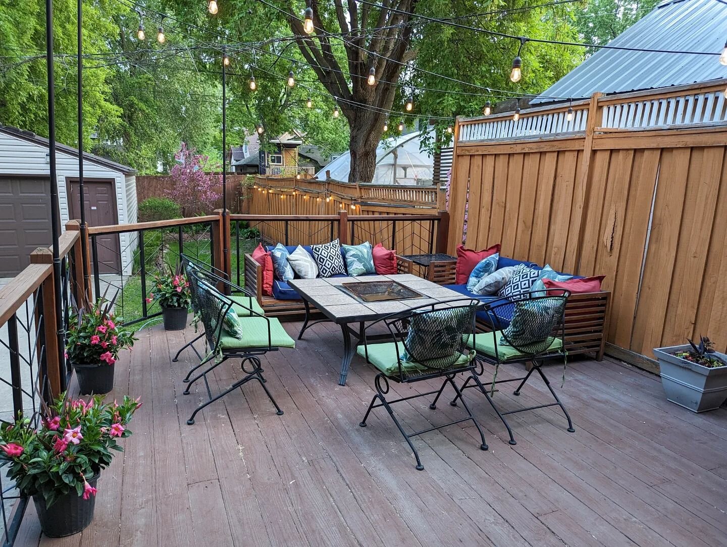
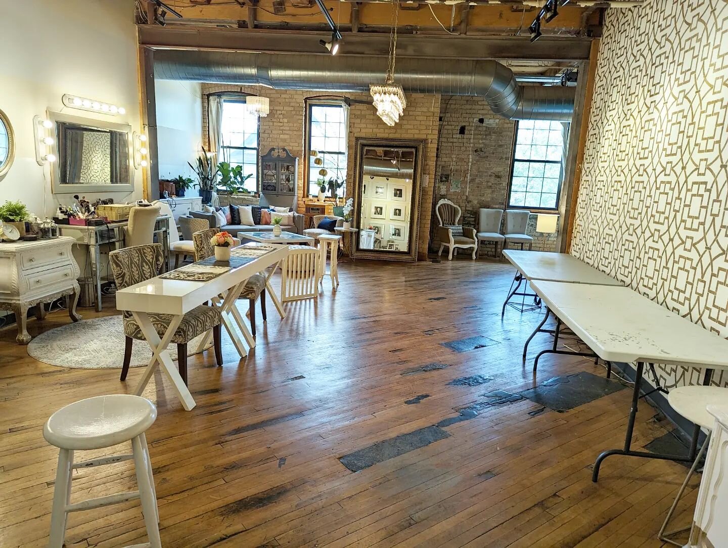
We recently went through a branding refresh in tandem with moving to a new studio space and redesigning our whole website. We put our heads together to determine in what ways we needed to redefine our brand. Our work and processes are constantly evolving, so why wouldn’t the same go for our brand? There was nothing wrong with our logo, or fonts, or colors. It all simply deserved a thoughtful evaluation to make sure anything we changed – or, just as importantly, anything we didn’t change – was because of a conscious decision to do so.

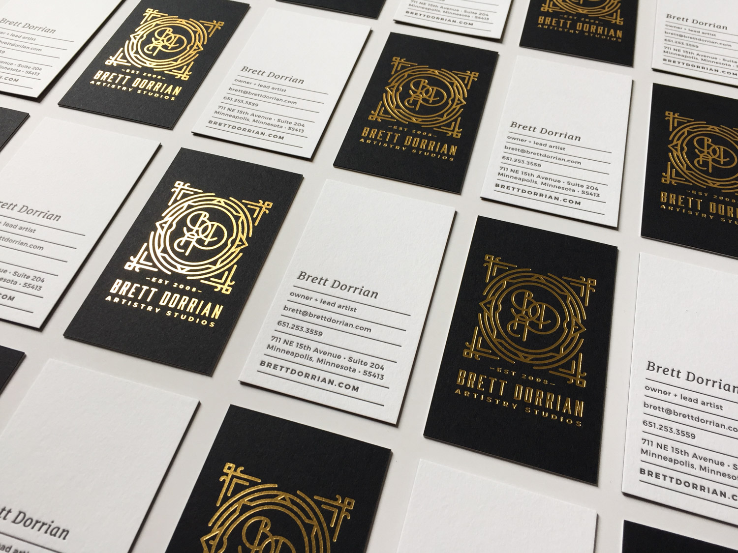
We decided that while the inspiration for our studio had really evolved into a mix of a more clean and bright, modern French, hint of Art Deco kind of vibe over the last year and a half, our logo and marketing collateral in general was still existing in a more heavily vintage/Deco place. We had to modernize our fonts and put the theatrics into the monogram of the logo. We had to move our colors to a more neutral palette overall with only pops of the coral red, French blue, and metallic accents we had come to use in our space.
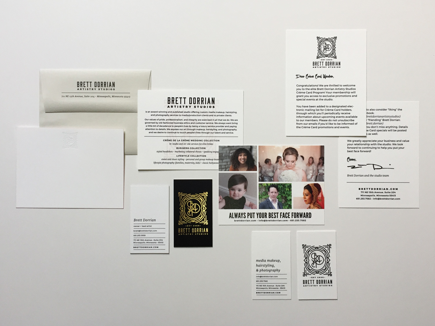
We had to (finally!) create a style guide so that we could have a foundation and style parameters as we embarked on the major projects of moving and remodeling a new studio, redesigning a website, and redoing all of our printed and electronic materials. It was a huge undertaking to say the least! Moving the studio meant we had to redo everything with our address on it, but that meant there was an opportunity to do a real branding audit and do more than just reprint envelopes and business cards with the new address.


One of the biggest lessons I learned and was very proud of myself for, was that I was willing to evolve and change.
I think many business owners are protective of a logo or look; basically it’s easier to be stuck than to change sometimes. And of course, it can be a tough conversation to have someone tell you that an old design could use a refresh – that the thing you chose and loved at one point isn’t serving your brand the way it used to.
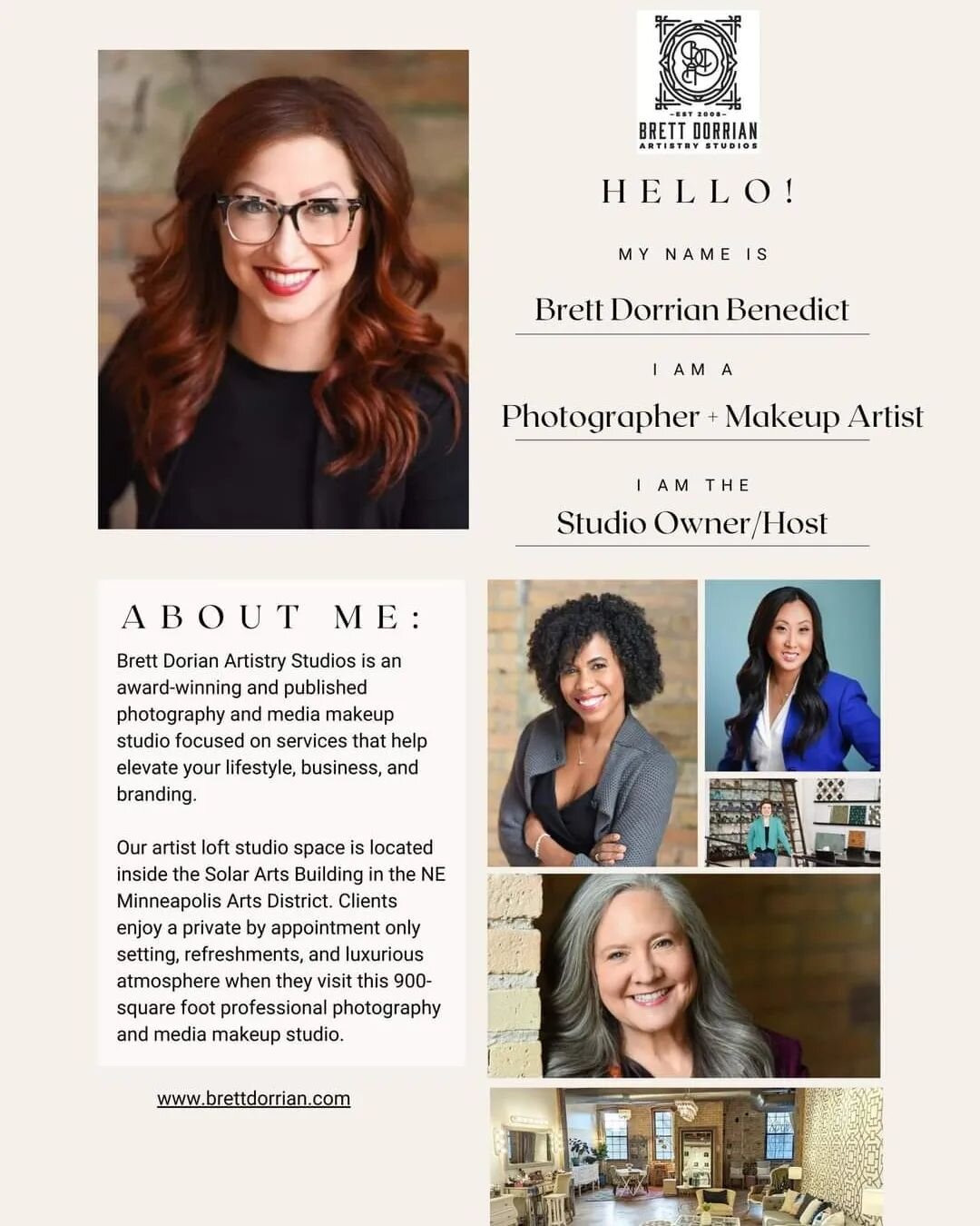
I had to trust our new in-house Senior Design Coordinator and Brand Manager, Megan, to be the expert to allow us to modernize the things that needed change. I built this brand into something great, but it was time to bring in more help to make it even more amazing! It was actually exhilarating since, as an entrepreneur, I love launching new things and new ideas. Because of Megan’s insane amount of design talent and our wonderful communication styles, along with Mallory making sure our messaging was on point, copy editing, and giving input all along the way, we were able to land on a truly amazing brand refresh.
Good branding is clear, consistent, and congruent with the message of who you are and how you do what you do.
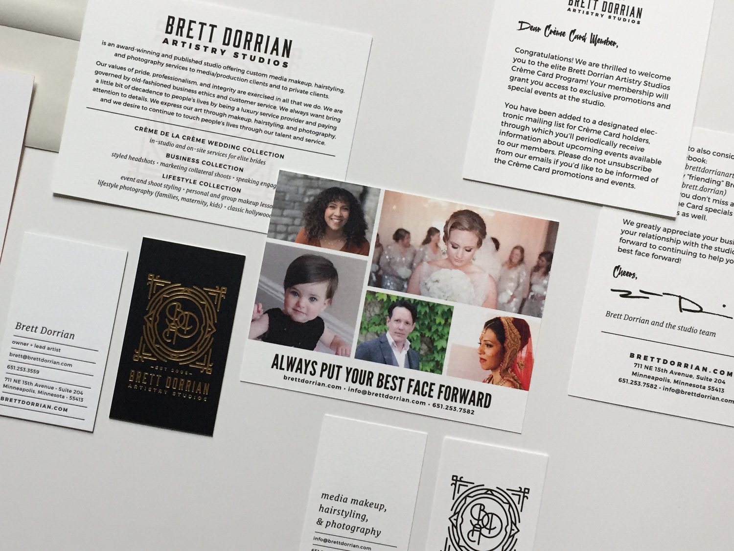
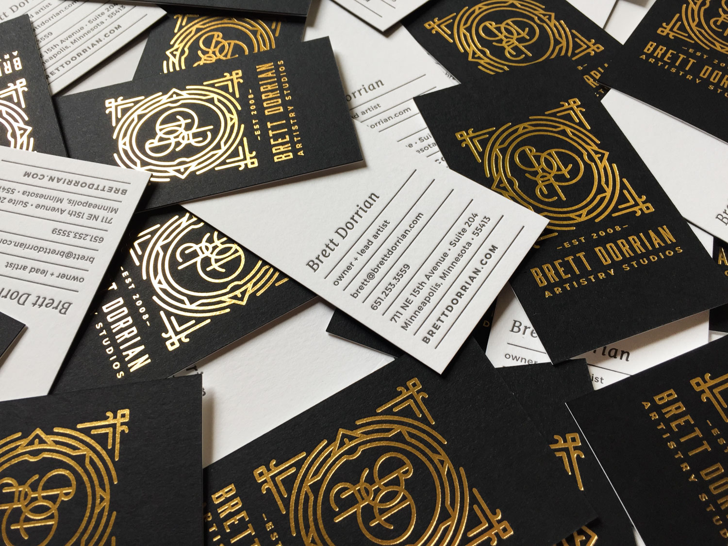
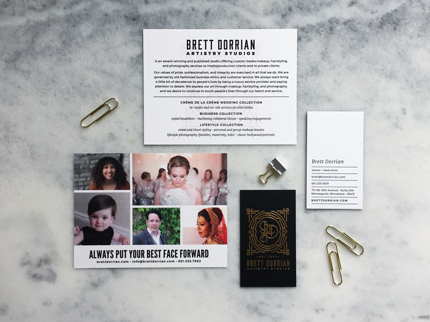
For example, we are a luxury studio and we pride ourselves on being a local small business and working with other local small businesses. Only the best will do for our clients, so we were sure to use awesome local printing options when it came time to print things.
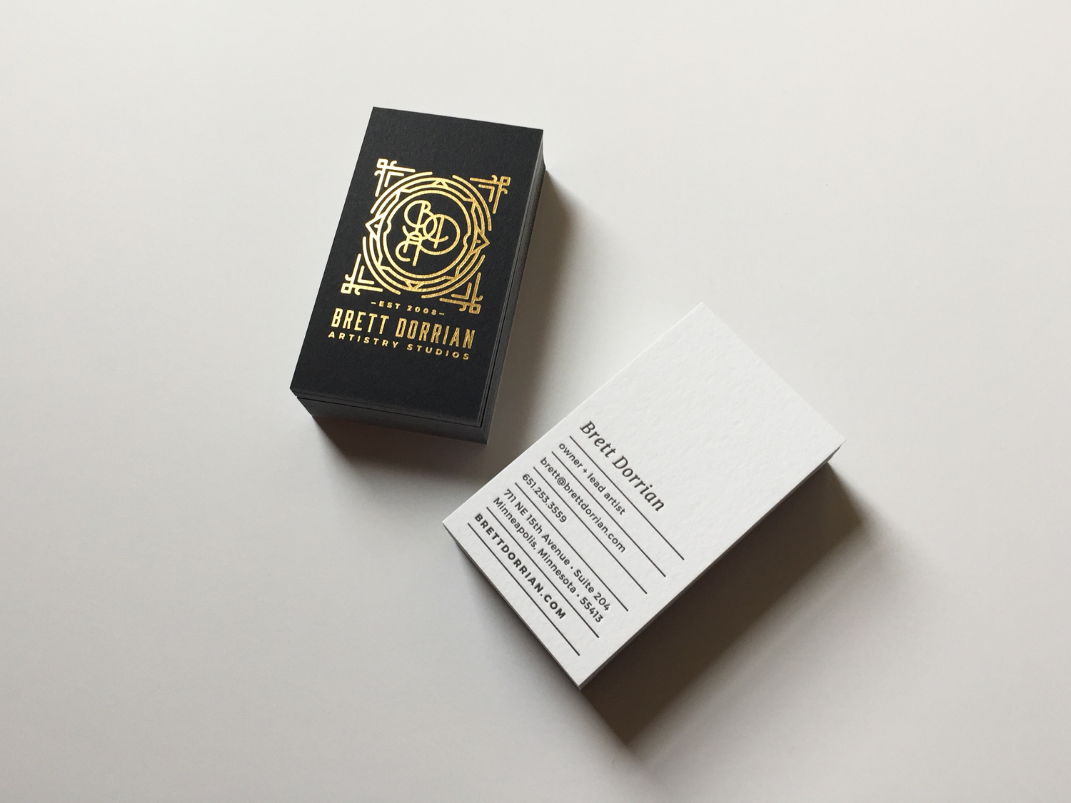
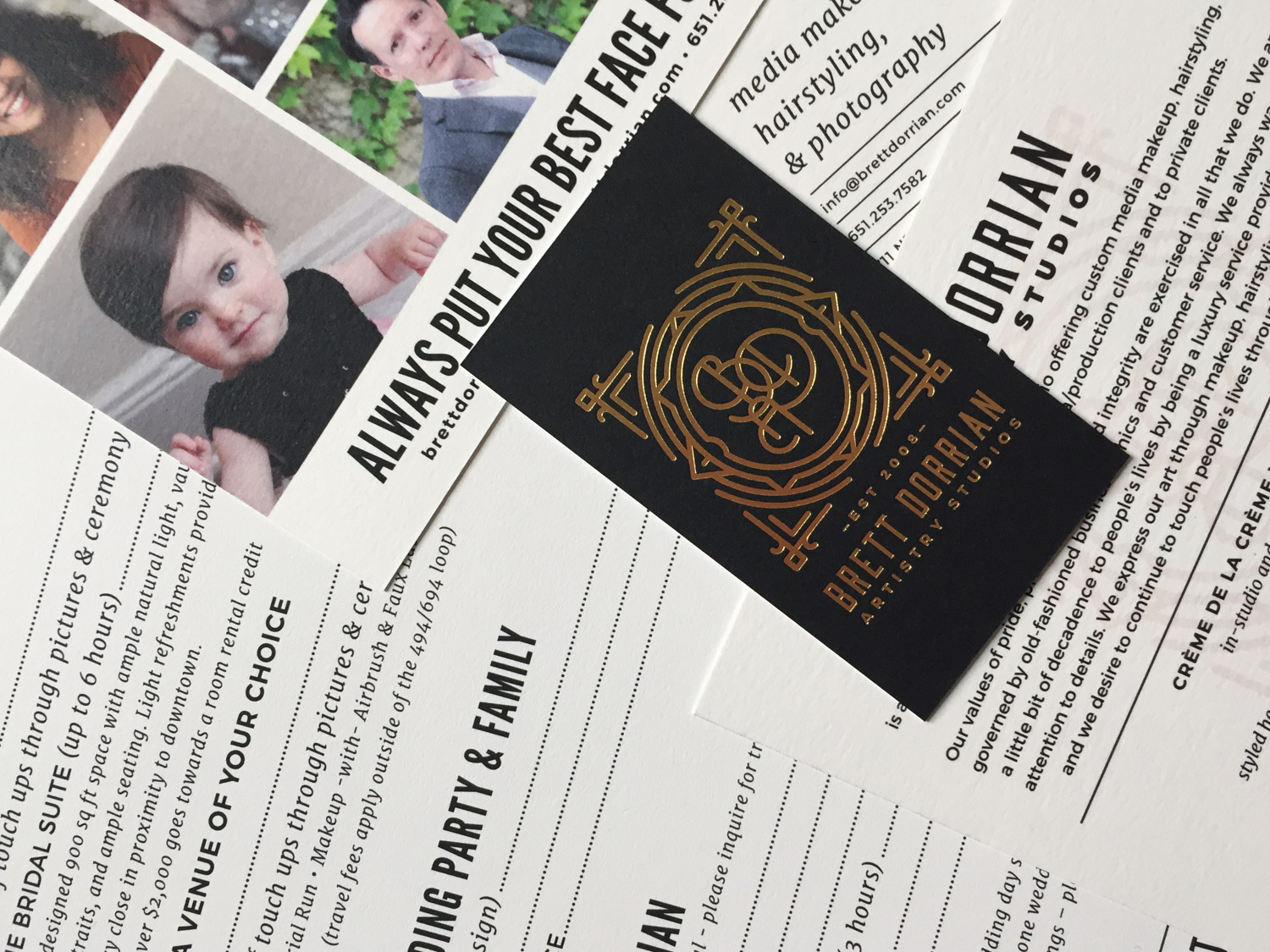
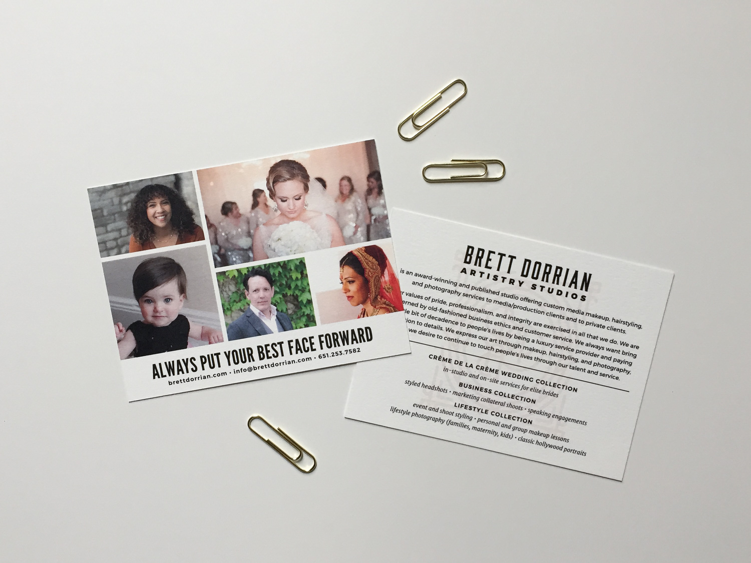
Studio On Fire did the most gorgeous job on our letterpress and foil stamped business cards and notecards. If you know me, you know that a good hand-letterpressed piece of physical collateral might just be my favorite thing to hold. Then Smart Set did all of our digital printing – so the envelopes, post cards, pricing sheets, etc. Holy buckets, has digital printing come a long way! We were very impressed with the high quality paper options and how beautifully everything printed.

This is the first time in my eight years in business where absolutely everything about our brand is totally on point and existing. I remember thinking early on about all the things we didn’t have in our marketing suite yet (because it’s all an investment, oh I know). Yet it was always really important to me to maintain a clear definition of our brand. I remember the first time I got to have a designed business card and my first logo. It felt like such a leap to not have to go through an online printer where you just entered in your contact information to their template, like you were ordering new checks or something. Here we are years later with a stunning suite that is completely befitting of our luxury studio in a way that makes everyone say “wow!” and “this is SO you!”